
Most businesses blame low conversions on traffic quality, ad performance, or pricing. In reality, conversions often fail for quieter reasons. Not dramatic design flaws. Not broken funnels. But small UX mistakes that slowly, consistently push users away without anyone noticing.
User experience doesn’t usually fail loudly. It fails silently. A visitor hesitates for half a second longer than they should. A form feels slightly annoying. A button doesn’t feel safe to click. Multiply those moments by hundreds or thousands of visitors, and conversions quietly disappear.
This is why UX is one of the most underestimated growth levers in digital marketing. Fixing small UX issues often produces bigger gains than increasing ad budgets or publishing more content. Below are the most common UX mistakes that kill conversions — and why they matter more than most teams realize.
Unclear Visual Hierarchy
When users land on a page, they should instantly understand three things: where they are, what you offer, and what to do next. If they have to think about it, you’ve already lost momentum.
A common mistake is giving too many elements equal visual weight. Headlines, subheadings, images, buttons, badges, and links all compete for attention. When everything looks important, nothing feels important. Users scan instead of act.
Strong visual hierarchy guides the eye naturally. One clear headline. One primary call to action. Supporting elements that don’t compete. Pages with clear hierarchy reduce cognitive load, making decisions feel easier and faster.
Too Many Calls to Action
More options rarely lead to more conversions. They usually lead to hesitation.
Pages overloaded with CTAs like “Get Started,” “Book a Call,” “Learn More,” “Download,” and “Subscribe” force users to choose instead of guiding them. Choice overload creates friction, even when all options are good.
High-converting pages focus on one primary action per page. Secondary actions exist, but they’re visually softer and never compete with the main goal. When the path is clear, users move forward with confidence.

Forms That Ask for Too Much
Forms are one of the most common conversion blockers. Every additional field adds friction, doubt, and resistance.
Asking for non-essential information too early signals effort, not value. Users haven’t built trust yet, so long forms feel intrusive. Even small things like phone numbers, company size, or job titles can reduce completion rates if they’re not clearly justified.
Short forms convert better. If more information is needed, multi-step forms work well because they break commitment into smaller psychological steps. The goal is momentum, not data collection at all costs.
Buttons That Don’t Feel Clickable
This sounds basic, but it’s surprisingly common. Buttons that look like plain text, blend into the background, or lack contrast reduce interaction.
Users rely on visual cues. Buttons should look interactive at a glance. Clear contrast, adequate size, and strong labeling matter more than style trends.
Even button copy affects UX. “Submit” is vague and transactional. Action-oriented language like “Get My Quote” or “See Pricing” feels clearer and safer. Small wording changes can produce measurable conversion lifts.
Slow Page Speed (Even When It’s ‘Not That Bad’)
Speed issues don’t need to be dramatic to hurt conversions. A delay of even one second can break flow and increase abandonment.
Users don’t consciously think, “This site is slow.” They just feel friction and lose patience. On mobile, this effect is even stronger. Slow pages create micro-frustrations that add up quickly.
Optimizing images, reducing scripts, and prioritizing performance isn’t just technical hygiene. It’s a direct conversion strategy.
Inconsistent Design Across Pages
When pages feel disconnected, trust erodes.
Inconsistent fonts, spacing, colors, or layouts signal disorganization, even if users can’t explain why. Trust is built through consistency. When each page feels like part of the same system, users feel safer continuing.
This is especially important for multi-step funnels. If landing pages, forms, and confirmation pages feel mismatched, users subconsciously question legitimacy and hesitate at the final step.
Navigation That Creates Decision Fatigue
Complex menus and overcrowded navigation structures overwhelm users quickly. Instead of exploring, they stall.
Navigation should simplify decisions, not expand them. Clear categories, limited menu items, and logical grouping help users orient themselves quickly.
For conversion-focused pages, navigation often does more harm than good. Many high-performing landing pages remove navigation entirely to reduce exits and keep users focused on a single action.
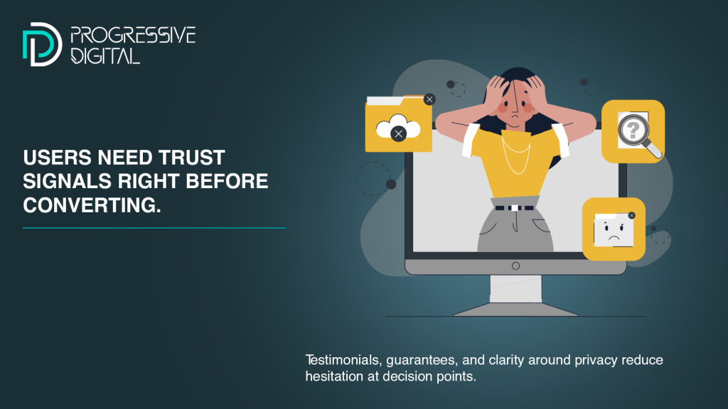
Lack of Reassurance at Critical Moments
Users hesitate right before converting. That moment is where reassurance matters most — and where many sites fail.
Missing trust signals like testimonials, reviews, guarantees, security indicators, or clear explanations create doubt. Users may want to convert but pause because something feels unresolved.
Reassurance doesn’t need to be loud. A short testimonial near a form, a privacy note under a field, or a simple guarantee statement can dramatically reduce friction at decision points.
Poor Mobile Experience
Mobile UX is still treated as a secondary concern, despite mobile traffic dominating many industries.
Small tap targets, cramped layouts, long scrolls, or pop-ups that are hard to close quickly frustrate users. Mobile users are less patient and more context-sensitive. Any friction feels amplified.
Mobile-first UX design isn’t about shrinking desktop layouts. It’s about designing interactions specifically for thumbs, small screens, and short attention spans.
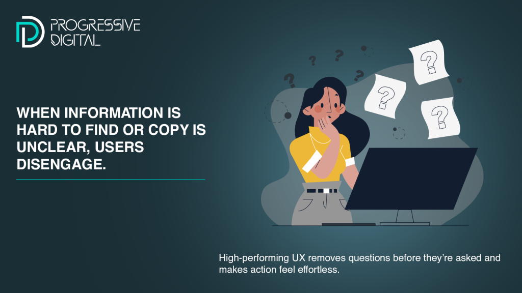
Forcing Users to Work Too Hard
The most damaging UX mistake is making users do unnecessary work.
This includes:
– Making users search for key information
– Hiding pricing or next steps
– Using vague copy that requires interpretation
– Asking users to remember things across pages
Every extra mental step increases friction. High-converting experiences feel effortless because they remove questions before users even ask them.
Why These Small UX Mistakes Matter So Much
None of these issues look catastrophic in isolation. That’s why they’re often ignored. But conversion is a cumulative experience. Small frictions compound.
A slightly confusing headline. A slow page. A long form. An unclear button. Each one chips away at momentum. By the time the user reaches the final step, motivation is gone.
CRO isn’t about dramatic redesigns. It’s about identifying and removing these silent blockers one by one.
How Smart Brands Approach UX Optimization
High-performing brands treat UX as a revenue lever, not a design task. They observe behavior, analyze drop-off points, and test assumptions continuously.
They don’t ask, “Does this look good?” They ask, “Does this help the user move forward?” Every UX decision is evaluated through the lens of clarity, ease, and trust.
Even small UX improvements can unlock significant gains when applied consistently across the funnel.
Final Thought
Traffic brings people to your site. UX decides whether they stay, trust you, and take action.
If conversions feel stuck despite solid traffic, the issue is rarely obvious. It’s usually hidden in small UX details that quietly shape user behavior.
Fixing those details doesn’t just improve conversion rates. It improves the entire experience — and that’s what turns visitors into customers, consistently and predictably.